

Even More On “Garlic Knot” Cities
Another look at the neighborhoods in cities and metros that aren't part of the revitalizing downtown or the sprawling suburbs.


A block of Chicago bungalow houses. Built between 1910-1930, they offered the first foothold into the middle class of millions of Chicagoans. Source: Chicago Architecture Center
I just can’t quit thinking about Bill Fulton’s “garlic knot” cities piece posted last month. This post will be the fourth (and probably not the last) piece of commentary on the subject.
A couple of weeks ago I pointed out the Economic Innovation Group’s Distressed Communities Index as a way of identifying distressed communities nationwide. Using the index, I showed a few different ways that community distress is concentrated within metro areas, coming up with the scattered, wedged and contained framing for how metros organize away (yes, that’s what happens) from distressed communities. Well, I went a little further.
I looked at the distressed community index for the core cities of each of the 54 U.S. metros with more than one million residents I excluded cities that had more than 250,000 residents but I deemed to be non-core cities of their metro area, like Long Beach, CA and Scottsdale, AZ). The analysis, however, produced some interesting findings.
Before I get into it I want to quickly explain my framework. While looking at maps of various metro areas on Economic Innovation Group’s website, I noticed that distressed zip codes seem to follow one of three (now four) patterns. First, distressed communities could be scattered distressed metros throughout an entire metro area, within the city and suburb. Metropolitan New York is a good example:

Distressed communities can be found throughout the New York metro area. They’re not concentrated in any particular area, even if most are located within the city itself.
Second are wedged distressed metros. Here, distressed communities start from a particular point of origin and spread outward, but usually in a general direction. I used Chicago as an example in another article on this topic:
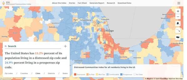
In metro Chicago, distressed communities were concentrated near the manufacturing complexes and rail lines of the South and West Sides, and continued to follow them out of the city.
Third, I identified contained distressed metros, where distressed residents are almost exclusively contained within the core city’s limits. Metro Cleveland is a good example of this pattern:

In metro Cleveland, distressed zip codes almost exactly mirror Cleveland’s municipal boundaries.
Lastly, and the most recently added, is the limited distress metros. Charlotte’s a good example:

Unlike the other metros above, Charlotte has no distressed communities within its city limits (although it has a few that fall into the at-risk category). That’s not to suggest that Charlotte is without distressed residents. It would be more accurate to say that Charlotte perhaps has fewer and more dispersed distressed residents than other metros.
First off, I want to acknowledge the obvious. The Distressed Communities Index categories are about metro area class structure and organization. People within metro areas structure themselves by social and economic class, sometimes with political boundaries in mind, and sometimes not. However they choose to do that, there ends up being within metro areas that receive a disproportionate share of investment, development, and affluent residents, usually at the expense of other areas.
Second, I was actually surprised to find more than a few core cities – and entire metros – with limited numbers of distressed communities. This is not to say that there are no distressed individuals in these places; it’s more accurate to say that individual distress is more broadly distributed throughout a metro area, which can later perceptions about general distress within a metro. As a result I added a new category to the framework, limited, to describe this.
That said, here’s what I found:
· The core cities of large metro areas hold quite a bit of the nation’s distressed communities. Nationally, distressed zip codes contain just over 15 percent of the nation’s population. However, distressed zip codes in core cities of large metros comprise 26 percent of total core city population.
· Yet there are some very well off core cities as well. Nine core cities – Austin; Charlotte; Denver; Omaha; Portland; Raleigh; San Diego; San Diego; and Washington, DC – have a majority of their residents within the comfortable and prosperous zip code categories. Austin shows up as a particularly affluent city, with 74 percent of its residents within the comfortable and prosperous categories.
· There’s quite a bit of merit to the framework I hypothesized. A look at EIG’s maps of community distress offers a preliminary estimate on metro area class structure and organization. Of the 53 metros in the analysis, I designated six as having a scattered structure; ten with a wedged structure; thirteen with a limited structure, and 24 with a contained structure.
· The ways distressed communities are distributed in core cities and metro areas differ significantly by region. Contained distress seems to be the dominant pattern in Midwestern cities and metros. Contained cities and metros exist throughout the South but are offset by the number of cities and metros that could fit the wedged, scattered or limited categories. The West has the highest number of cities and metros with limited distress.
This chart illustrates how the framing types are distributed geographically:

What does it all mean? A number of things immediately come to mind. It means that there’s some kind of process by which metros organize distress communities within them. It implies that as the number of people of color and/or the number of low-income people increases within a metro, the process alters. It suggests that distressed communities are isolated, while more affluent communities are insulated. It tells us that some metros have the ability to “outgrow” their older, smaller city and create a younger, larger one, while others don’t. It reminds us that the work of cities, to facilitate the exchange of knowledge and ideas, to effectively and efficiently offer goods and services, and to increase human productivity, is never done.
In other words, nothing we didn’t know already.
“ It tells us that some metros have the ability to “outgrow” their older, smaller city and create a younger, larger one, while others don’t.” What does this mean? What are examples of cities that outgrow versus those that don’t? It wasn’t clear from this post (maybe it was in the last post, which I read but unfortunately don’t recall particularly well).
This is very interesting! One thing I've noticed in looking at the other catagories (and at other income and educational attainment mapping sites in the past) is how the pattern of distressed neighborhoods appears to be shaped by the interplay of larger patterns of neighborhood segregation (at risk vs affluent for example), and the overall levels of distress vs affluence within a region.
Metro Atlanta seems to be one example of this, as even though it's actual distressed areas are somewhat scattered, it's more broadly affluent vs less affluent areas have a much more wedged pattern. But Atlanta's several less affluent wedges are broad. So given Atlanta's overall prosperous New South profile as well as the presence within the region of older outlying towns, its distressed neighborhoods are scattered within multiple larger, less favored (but mostly non distressed) sectors.