The Metro Framing Urbanists Didn’t Know They Needed
Let's put an end to the endless apples-to-oranges comparisons we make with respect to metro areas.
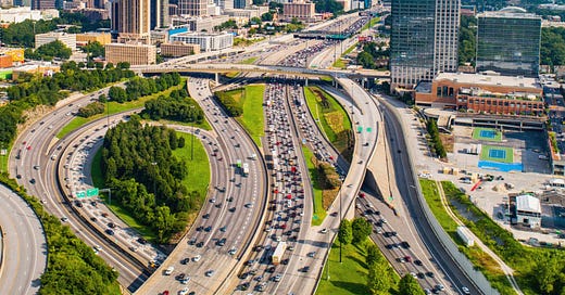
Atlanta has a great looking downtown, but the region as a whole is overwhelmingly suburban. Source: gettyimages.com
If you’ve ever taken any interest in how cities grow and evolve, I’m sure you’ve noticed this before.
Urbanists want data. We want data that helps us understand how the places we love and live in got to be what they are. We want to know what makes them tick, what’s replicable. All kinds of data points are gathered all the time to evaluate and compare what’s happening within and between metropolitan areas. It could be population change, in- or out-migration patterns, GDP data, whatever. Data helps us answer our questions.
Yet there’s quite a bit of variability in how urbanists view the places we study. We haven’t quite agreed on the appropriate scale of analysis for urban comparisons, and that can lead to widely varying results. Exploring data at a neighborhood level gives you great information about a particular neighborhood, but your findings can’t be extrapolated to an entire city, much less a metropolitan area. Metro level data can mask not only neighborhood or city level trends, but subregional trends that aren’t often explored at all. You can find the data you want to support or dismiss any claim you like, at the scale you want.
This is a problem that needs solving.
Scale, History and Perceptions
The differences might seem meaningless, but they’re not. Take metro Atlanta (6.3 million people) and metro Philadelphia (6.2 million); they’re very nearly the same size. In that respect they should be fairly comparable. But at the city level, is it fair to compare data between the city of Philadelphia, with 1.6 million residents under its jurisdiction, with the city of Atlanta, with just 500,000? Philly has municipal authority over a much larger population than Atlanta does and has to govern like it. Atlanta’s suburbs have much more authority over the entire region’s population than Philly does, but they rarely get mentioned independently of the “Atlanta region” they’re in.
Here's another example. Metro St. Louis has about 2.8 million people, of which 300,000 live in St. Louis itself. Metro Austin is slightly smaller than metro St. Louis, with 2.4 million people. However, the city of Austin is primed to become the next American city to cross the one million population threshold. Is it fair to compare the city of St. Louis to the city of Austin? In population terms, wouldn’t it be fairer to compare Austin with Philadelphia, and St. Louis with Atlanta?
Then there are vast historical differences to consider as well. In 1990 it would’ve been ludicrous to compare metro Austin with metro St. Louis, from a population perspective. Back then, metro St. Louis (2.6 million) was nearly four times larger than metro Austin (780,000). At that same time it would’ve been more conceivable to compare metro Philadelphia (5.4 million) with metro Atlanta (3 million). But differences in growth patterns before and after 1990 created vastly different metro areas.
Scale is how urbanists measure urban importance, but there’s no consistency to it.
History also has a lot to say about how cities evolve, too. American cities of 1924 were far more densely built than the cities of 2024. Cities of 100 years ago are substantially influenced by the commercial districts, housing and infrastructure established then. Cities that evolved much more recently are influenced by very different ideas and technologies.
When taken together, opinions about metro scale and metro history lead to individual perceptions and decisions that influence a metro area’s future scale and the narrative that drives it. Perceptions of a core city generally lend themselves to an entire metro area. Core city perceptions can also be metro area perceptions, but not always. A large and dominant core city like Austin could be developmentally like the rest of its metro area. Austin’s general perception of booming growth extends to the entire region. A smaller city in a larger region, like St. Louis, has had a history of decline over the past 75 years or so. St. Louis has also lent its perceptions to its entire metro area, even if the metro areas doesn’t share many of the same challenges as the city.
There needs to be a systematic way of evaluating the health and strength of metro areas. If one doesn’t emerge, then we’ll always be stuck with apples-to-oranges comparisons of our built environments. We would not compare the health of a 24-year-old person with an athletic background with that of a 54-year-old sedentary person, would we? But that’s exactly what we do when comparing some metro areas.
Quantifying Cities, Suburbs and Exurbs
My proposal: a three-level framing of metro areas that brings us closer to actual comparisons. The first level is the core city, the original location that lent its name to the entire region. The second level is the urban area, which is comprised of contiguous built-up areas with at least 1,000 people per square mile residing in it. The third level is the area beyond the urban area but still within the boundaries of the broader metro area (which draws its lines at counties).
Breaking down a metro area in this fashion creates three levels for easier and more consistent analysis:
· The core city;
· The suburbs (the urban area minus the core city); and
· The exurbs (the metro area minus the urban area).
Here’s a map to show you what I mean, using the Chicago metro area as an example (please note, this map only shows the Illinois portion of the three-state Chicago metropolitan area that extends into Indiana and Wisconsin, and thanks to the Chicago Metropolitan Agency for Planning for producing the base map data used to develop this):
The green area in the image is Chicago. Within the city boundaries are Chicago’s 77 community areas, groupings of smaller neighborhoods that the city’s been using for smaller scale analysis for nearly a century. The light blue areas are incorporated suburban communities beyond Chicago’s boundary but within the (approximate) urban area boundary. The yellow areas on the periphery are the exurbs – incorporated suburban communities beyond the urban area boundary. The gray areas are unincorporated areas. Within the urban area boundary many unincorporated areas are recreational open spaces. Beyond the urban area boundary many unincorporated areas are farmland, or small settlements that could be emerging into new incorporated communities.
Back in 2021 I took a stab at organizing the nation’s largest metro areas in this manner. Here’s how population at each level looked for the 53 metros with more than one million residents, using 2019 American Community Survey data:
Using the data above I found that on average core cities comprise about 25% of a metro area’s population, suburban areas 57%, and exurban areas 18%. But there’s wide variability. Some metro areas are core-city dominant; San Antonio’s population is more than 60% of its metro area’s total, San Jose’s more than 50%. Others are suburb-dominant; almost 92% of metro Miami residents live in the suburban tier. And while exurban areas are supposed to be emerging areas that aren’t dominant, there are a few metros with significant exurban populations: Charlotte (43%), Nashville (44%) and Riverside/San Bernardino (54%) stand out as exurb-dominant metros. Of course, I’ve always wondered if Riverside/San Bernardino deserved its place as a metro area when it sits immediately adjacent to metro Los Angeles.
This matters when one considers the development narrative for each metro. I mentioned earlier how differences in perception of Austin and St. Louis influence metro perceptions, and ultimately, growth patterns. But Miami and Atlanta, both suburb-dominant metro areas, likely have perceptions that are quite different from their realities. Miami’s gleaming condo towers on beautiful beaches certainly exist but are probably far from the mundane reality of most metro residents. The same can be said regarding differences between Atlanta’s sparkling downtown and sprawling suburban development on the periphery.
There will be more on this soon.